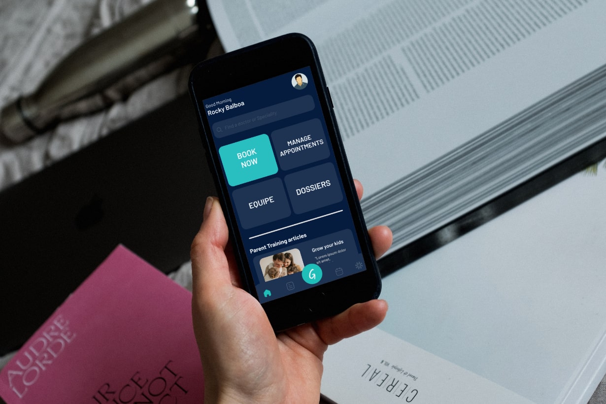
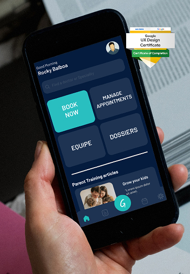
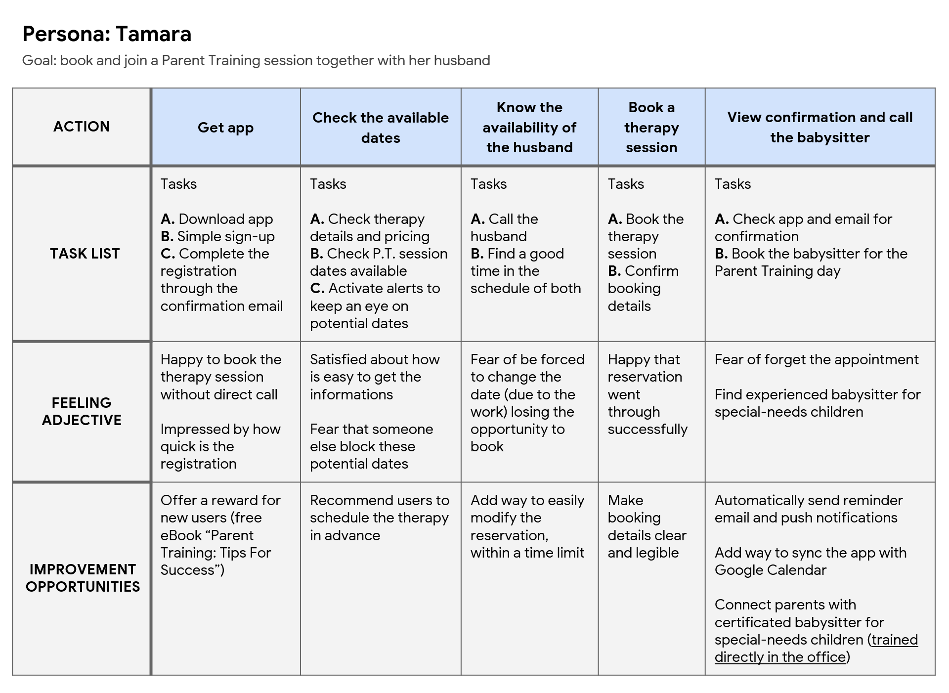
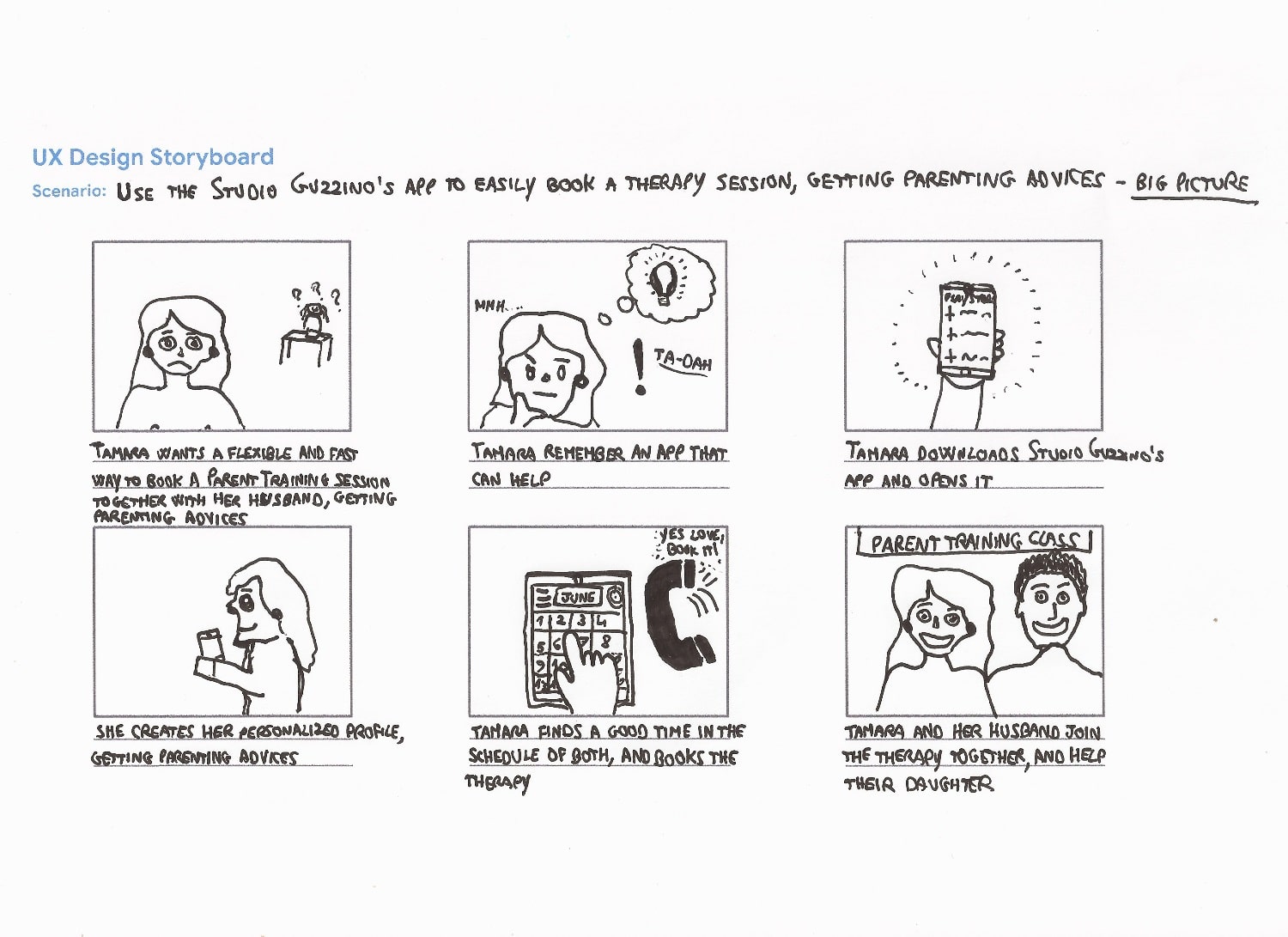
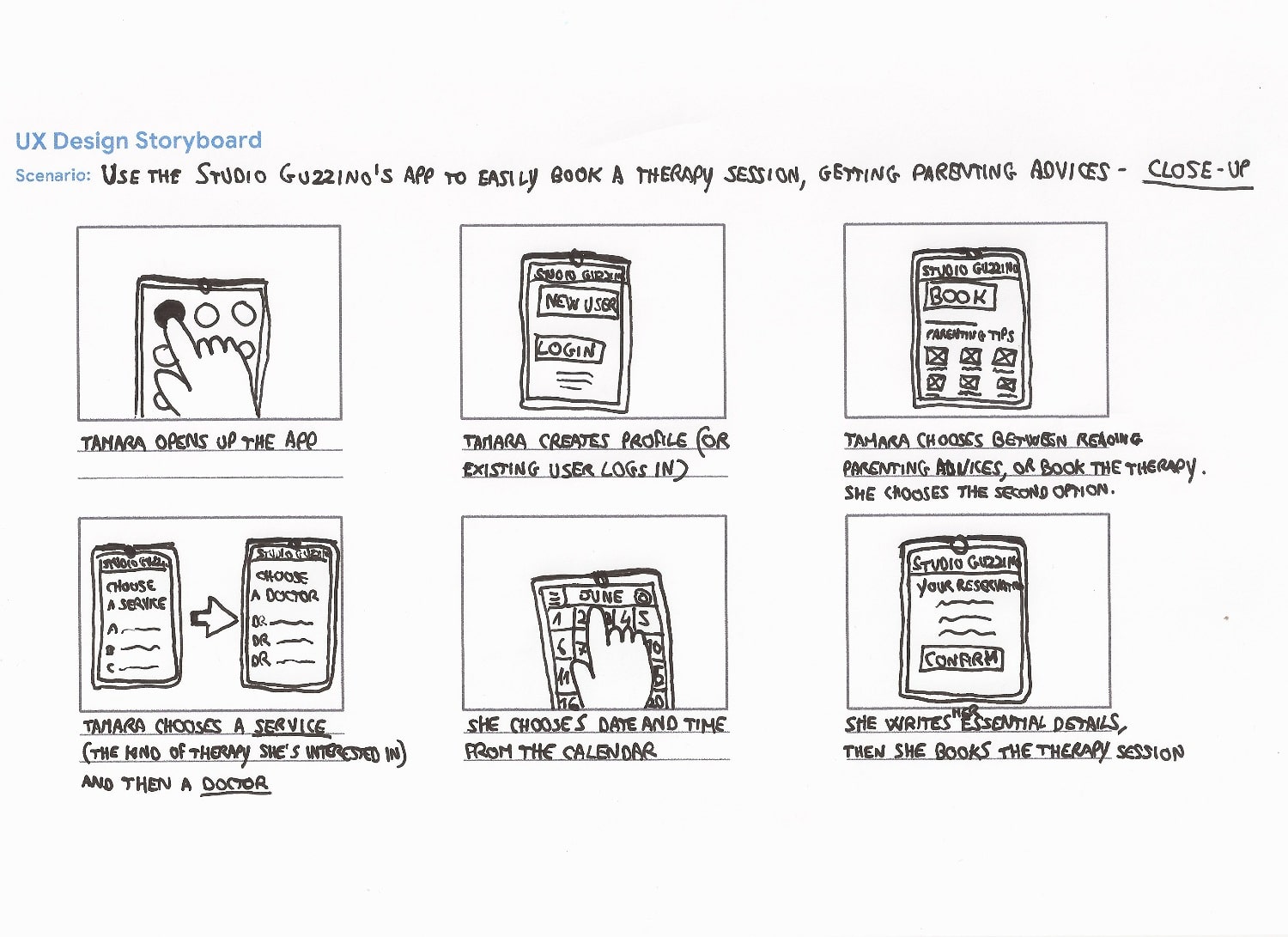
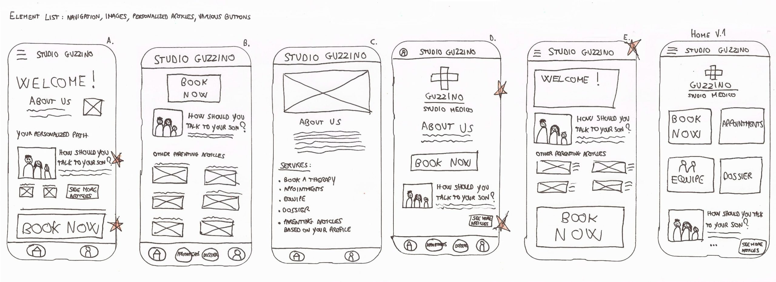
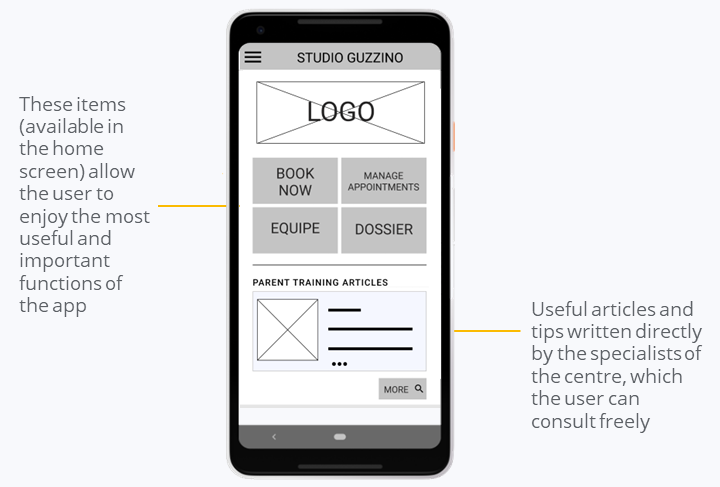
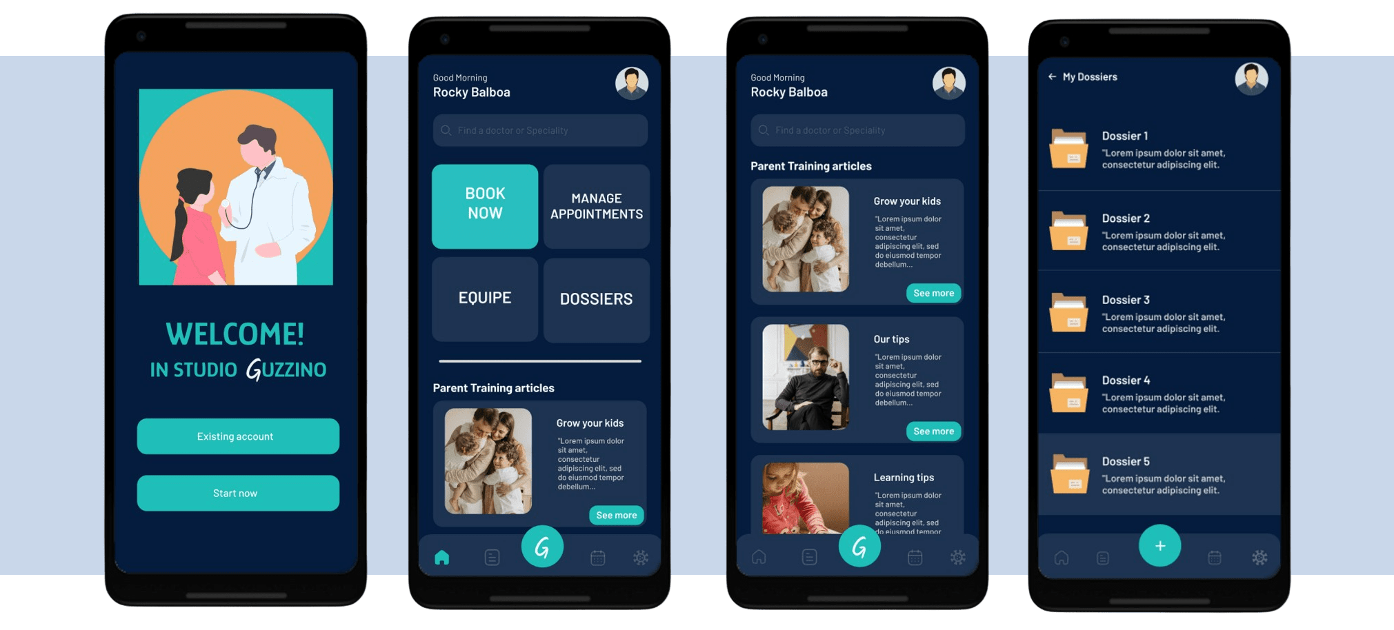
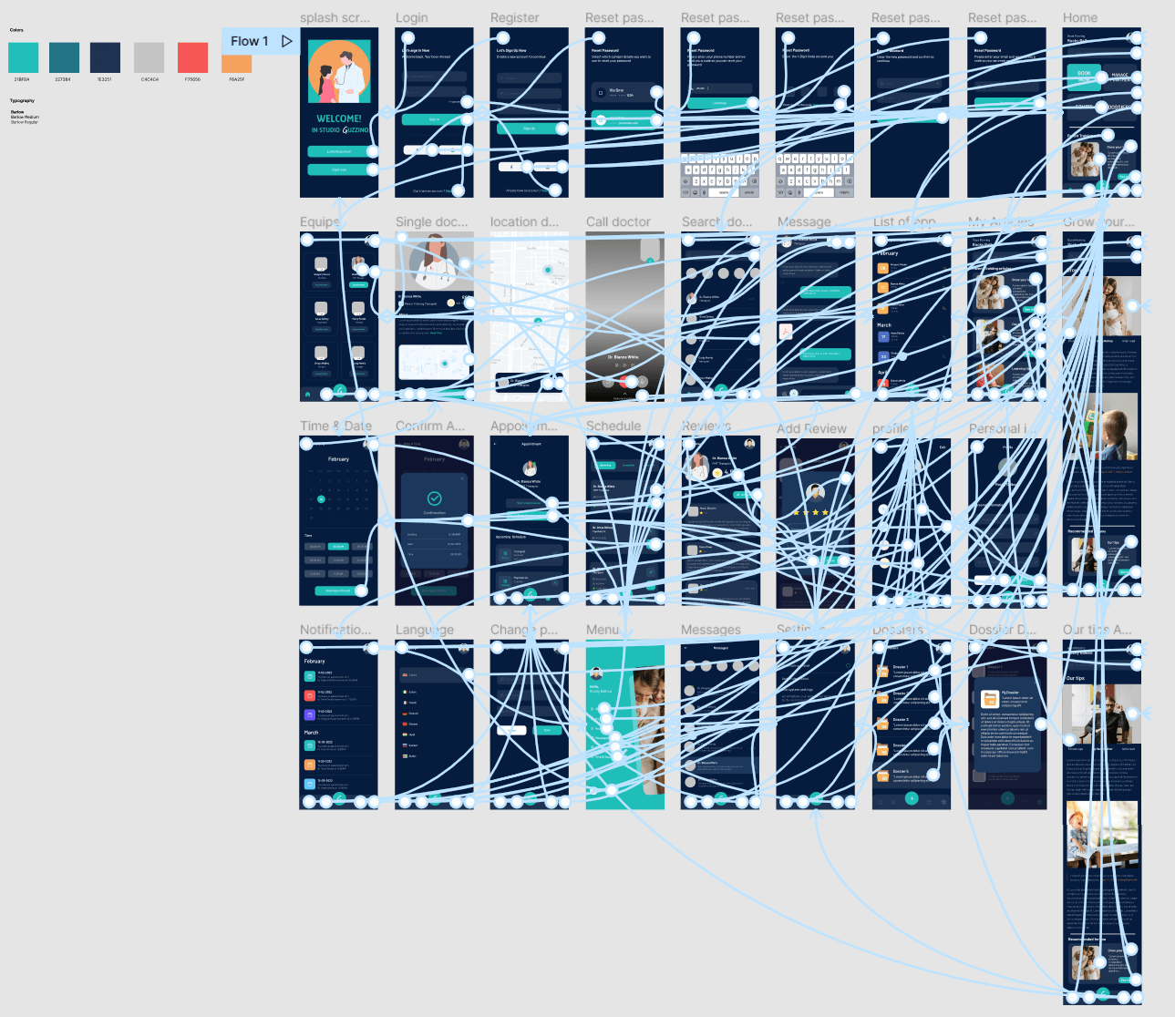
Studio Guzzino is an app that allows the user to book appointments in a therapy studio in Rome, offering the opportunity to read articles and tips on Parent Training.
The studio really exists, I also developed a website for them.

This is one of the project works I realized during the 6 months course Google UX Design Professional Certificate, developed by Google.
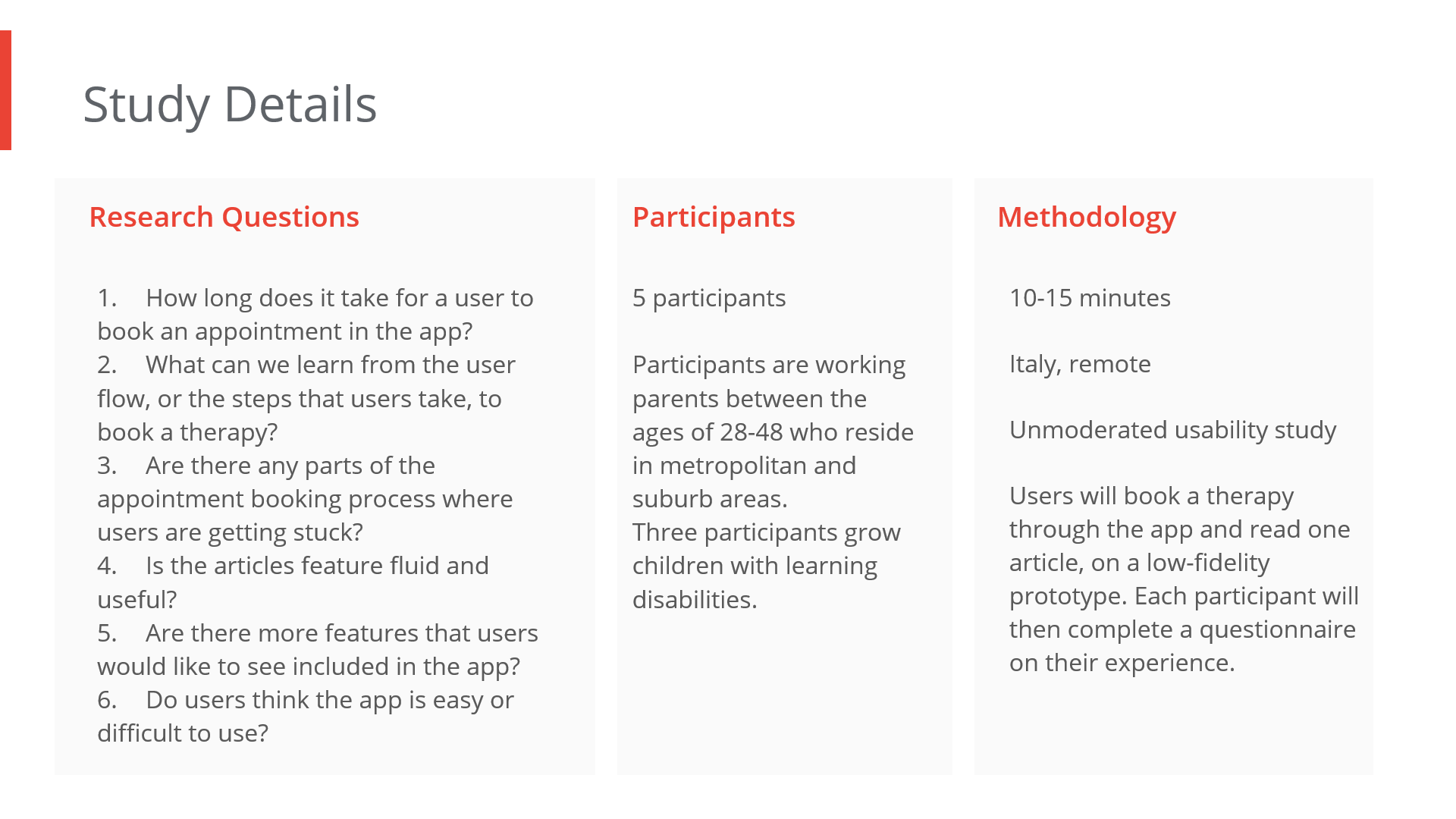
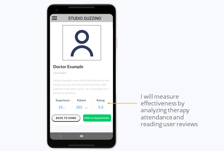
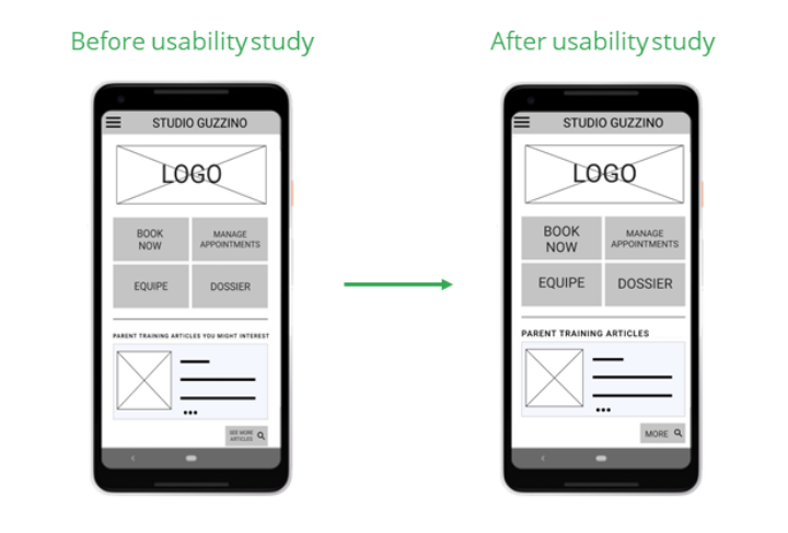
This course allowed me to learn the foundations of UX design, including building wireframes and prototypes, using Figma & Adobe XD and conducting research to test my designs.

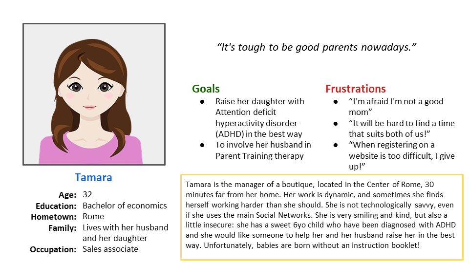
My main takeaway from this journey was the importance of empathizing with the user, a mindset that all UX designers need to cultivate 🌱

Client Name

Dr. Guzzino

Release Date

10 Giugno 2022

Project Types

Mobile app

Hand holds smartphone with Studio Guzzino's app displayed
Hand holds smartphone with therapy app with Google UX Design Certificate banner

I conducted a UX research Study, with the goal of determine if users can complete core tasks within the prototype of the Studio Guzzino’s app; determining if the Studio Guzzino’s app is difficult to use: item selection, booking, reading articles and in-app navigation

Diagram showing Usability Study details

User pain points

1. Time

Working adults are too busy to spend time on phone calls

2. Difficult UX

Installing and using apps can be a challenge for those that aren’t technologically savy

3. Parenting is hard

Parents need help to raise their children, especially those with learning difficulties

Persona & problem statement

Tamara is a working mom who is raising a 6yo child with ADHD, who needs a flexible and fast way to book a Parent Training session, for her and her husband because finding a good time in the schedule of both is hard, and their working time is variable

Tamara Problem Statement for the app

User journey map

Mapping Tamara’s user journey reveal how helpful it would be for users to have access to Studio Guzzino’s app

Tamara Journey map study for the app

Big picture & Close-up storyboard

After various researches (Competitive Audit Report, User Flow studies, Goal Statement and Crazy Eights) it’s time to be creative!

Big picture storyboards focus on what the user needs, their context, and why the product will be useful to the user

Six big picture storyboard for Studio Guzzino's app

Close-up storyboards concentrate on the product and how it works. They’re best used in the middle to the end of the design process

Six close-up storyboard for Studio Guzzino's app

Paper wireframes

Paper wireframes save a lot of time and effort and they are the best way to convert thoughts into something actionable.
Image of paper wireframes including five different versions of the same screen and one image of the new, refined version

Five paper wireframes for ideating app

* Stars were used to mark the elements of each sketch that would be used in the initial digital wireframes

Digital Wireframes

My goal is to streamlining reservation process, allowing parents to get parenting advices

First digital Lo-Fi Wireframe of Studio Guzzino's app

This low fidelity wireframe shows the skeleton of the website and how it is going to be emplemented

Second digital Lo-Fi Wireframe of Studio Guzzino's app

Usability Study Findings

I conducted two rounds of usability studies. Findings from the first study helped guide the designs from wireframes to mockups. The second study used a high-fidelity prototype and revealed what aspects of the mockups needed refining.
Many insights collected, these usability studies has been really helpful!

Round 1 findings

1. Users want more graphics to make site friendlier
2. It’s necessary to resize the fonts, are too small
3. 3 out of 5 total participants are not happy to share their personal data

Round 2 findings

1. Improve the way user can change doctor: I must make it easier
2. Article feature? Top!
3. Make colors higher contrast to improve readability

Mockups

After the usability studies, I changed the font size.
Perhaps has been a trivial change, but has proved very important for users.

In addition I decided – at least for the moment – to remove the pay-in-app feature: according to the study, it would have constituted a limit rather than an opportunity (due to the user’s reluctance to leave personal data).

Two phone screens showing differences after Usability Study

« I don’t like to spread my phone number, but I understand why in this in this situation is necessary. Anyway, I'm not sure I would use this app: maybe I would prefer to call directly the studio. In my opinion you should show the number in the homepage, as a second option »

« I love the customization feature, but I need another pair of glasses! It's difficult for me to read the numbers! »

Accessibility considerations

1. Screen readers

Provided access to users who are vision impaired through adding alt text to images for screen readers

2. Font

Accessibility for text size where I didn’t use text less than 16 px so it won’t be hard for the users to read

3. Images

Used detailed imagery for describe sections to help all users better understand the designs

Refined designs

High-fidelity prototype

View the Studio Guzzino’s high-fidelity prototype  👈🏻


Hi-Fi Prototype of Studio Guzzino's app

Takeaways

I conducted two rounds of usability studies. Findings from the first study helped guide the designs from wireframes to mockups. The second study used a high-fidelity prototype and revealed what aspects of the mockups needed refining.

Impact

The app makes users feel like Guzzino’s app really thinks about how to meet their needs.

One quote from peer feedback:

« In other app the signup process is longer, this one is easier! »

What I learned

I learned how to make a design for different kinds of users, listening to their feedbacks and making a product that works perfectly for them

Next steps 🚀

1. Create more screen

Next step is creating more screens to match user’s needs

2. Testing

Conduct another round of usability studies to validate whether the pain points users experienced have been effectively addressed

3. User research

Conduct more user research to understand how to add a payment feature by asking for as little personal data as possible

© 2021. All rights reserved to Luca Rinonapoli
Privacy Policy

You cannot copy content of this page !!🔒

✉️ CONTACT ME